Forty pieces of insignia at one magnification. Arranged not by seniority but by visual grammar: everything that signals by repetition, then by metal, then by position on the body.
Rank insignia looks like a thicket. Every service has its own, none of them agree, and the charts that try to reconcile them run to hundreds of rows. Laid out by seniority — private at one end, field marshal at the other — the material tells you almost nothing, because seniority is the one thing the objects themselves do not encode.
Sorted a different way, by how each device physically signals, the thicket turns out to contain three ideas. Insignia signals by repetition, by emblem, or by metal and position. Almost everything ever issued is one of those three, and systems that look unrelated turn out to be making the same move.
One: repetition
The commonest and the most legible. A shape is stamped, woven or sewn, and then repeated: one chevron, two chevrons, three. Nothing has to be recognised, only counted, which is why it survives being seen at distance, in bad light, on a moving person, by someone who has never been taught the system.
It is also the cheapest to manufacture and the cheapest to change. A promotion is another stripe on the same sleeve, not a new badge from a different die.
The lowest grade in one service's sleeve system: a plain field, no marks. A system that counts has to start at zero, and the zero has to look deliberate rather than unfinished. This is what nothing looks like when nothing is a rank.Wikimedia Commons · 120089516 · 2022-07-04 · I0BackFire0I · CC BY-SA 4.0The same field carrying a single chevron. One mark. From here the whole ladder is addition, and the wearer's position can be read by anyone who can count to five.Wikimedia Commons · 120089515 · 2022-07-04 · I0BackFire0I · CC BY-SA 4.0Three chevrons, same width, same spacing, same field. The spacing is the engineering. Chevrons set too close read as a block at twenty paces, and a system that cannot be counted at distance has lost the only advantage repetition gives it.Wikimedia Commons · 120089514 · 2022-07-04 · I0BackFire0I · CC BY-SA 4.0Chevrons with a rocker curving beneath them. Where counting runs out. Adding a fourth and fifth chevron would make the badge unreadably dense, so a second shape is introduced — and the system stops being purely countable at exactly the point it stops being legible.Wikimedia Commons · 120089513 · 2022-07-04 · I0BackFire0I · CC BY-SA 4.0The senior grade: chevrons, rockers and a device between them. Three mechanisms stacked on one badge. By the top of a sleeve system you are no longer counting, you are recognising — which is the next idea, arriving early.Wikimedia Commons · 120089518 · 2022-07-04 · I0BackFire0I · CC BY-SA 4.0
A chevron asks you to count. A badge asks you to know. The first works on a stranger at fifty paces; the second works only on someone who has been taught, and that difference is the whole design decision.
Two: emblem
The second mode replaces counting with recognition. A creature, a plant or a figure stands for a grade, and the wearer's position is legible only to someone who has learned the correspondence. It buys enormous range — there is no limit to how many distinct animals a system can name — and it pays for that range with a training requirement.
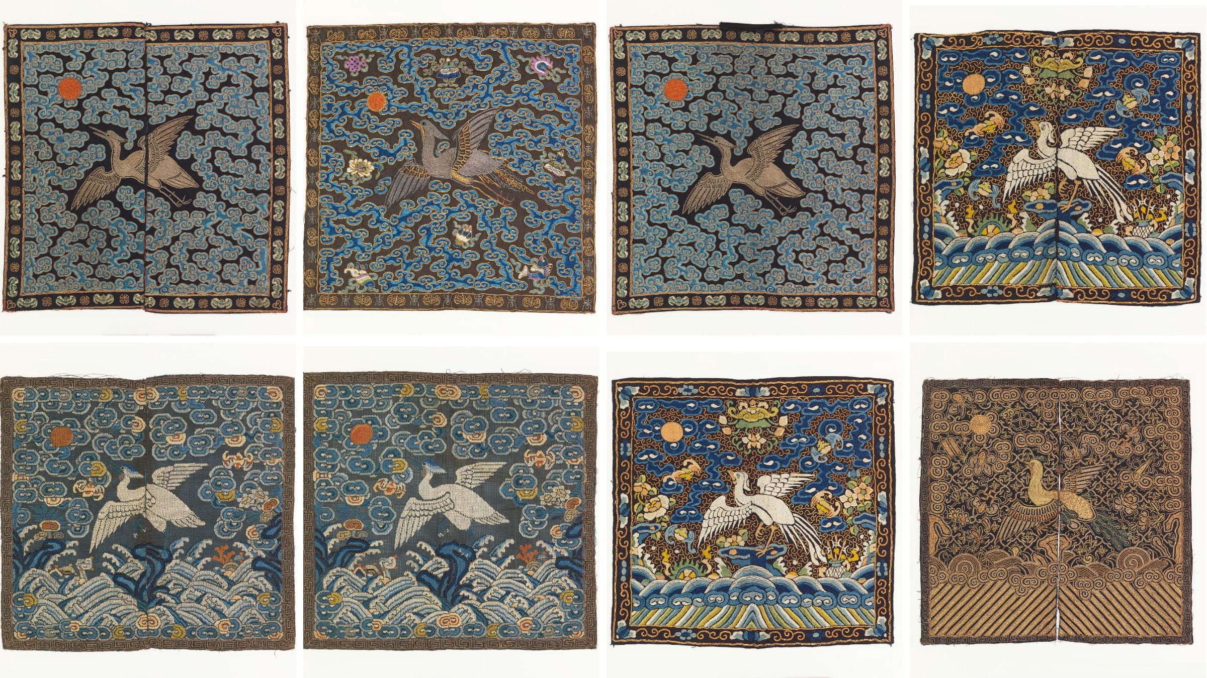
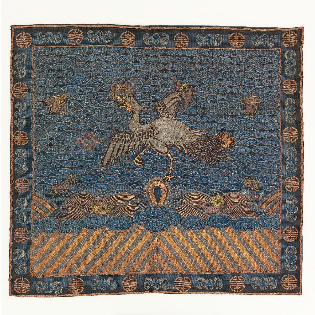
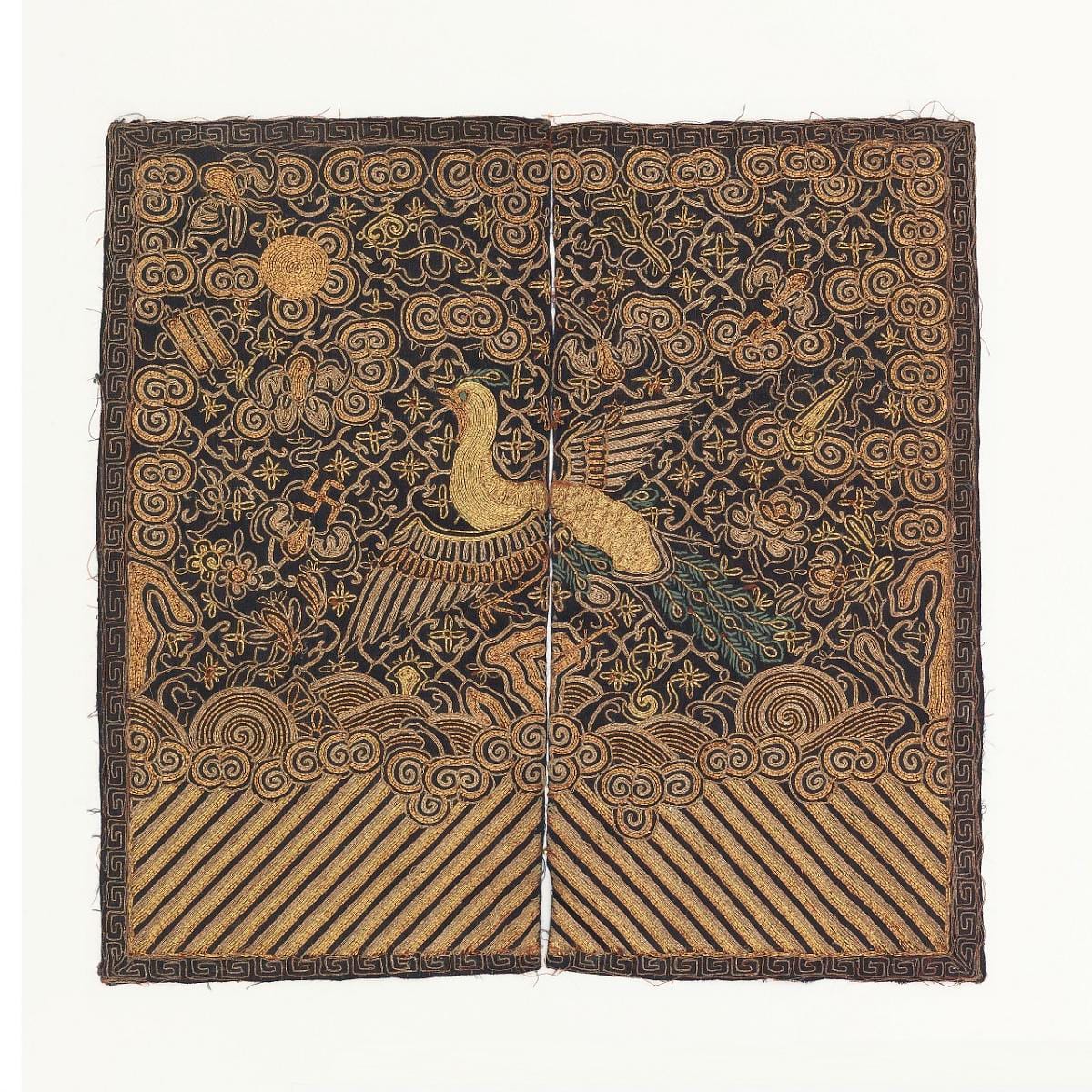
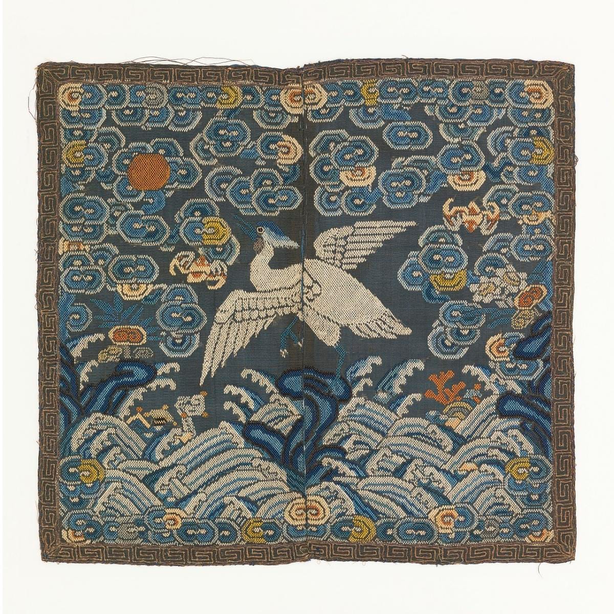
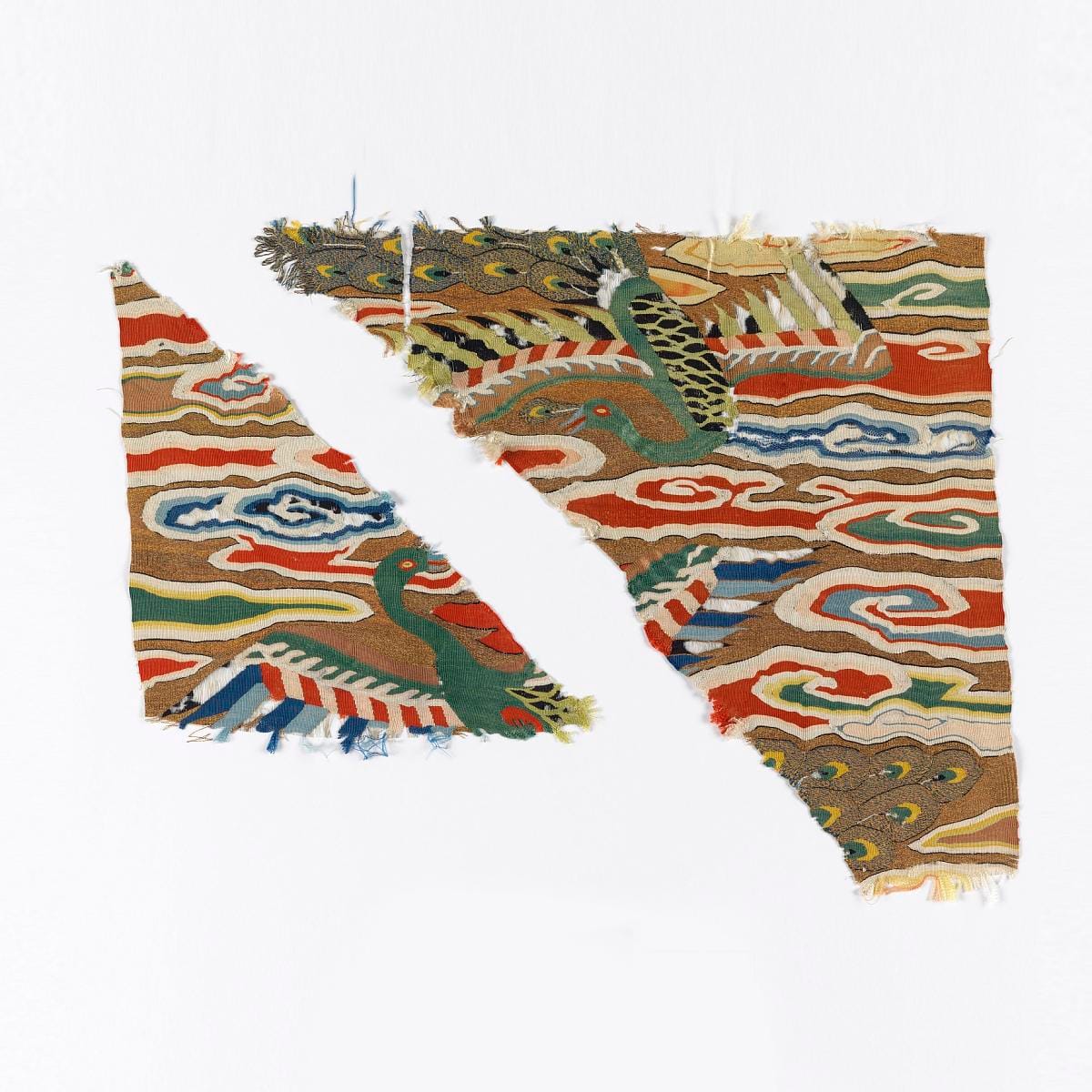
The Chinese civil and military service used squares of embroidered silk, worn front and back. Birds for the civil ranks, beasts for the military, in a fixed order. What is striking laid side by side is not the variety but the constancy: the frame, the scale, the sky, the wave border at the foot are identical from square to square. Only the animal moves.
A rank square: a single bird against cloud, sun disc at one corner, a band of stylised waves along the lower edge. Everything except the bird is fixed. The border, the sun, the waves and the proportions recur on every square in the series, which is what makes the one variable element readable at a glance by anyone inside the system.Cooper Hewitt, Smithsonian Design Museum · CHSDM-1941-31-40MattFlynn · mid- 19th century · creator not recorded · CC0Another square, same construction, a different creature. Set beside the last one the grammar is obvious and the vocabulary is not — which is exactly the trade an emblem system makes.Cooper Hewitt, Smithsonian Design Museum · CHSDM-1941-31-45-a_bMattFlynn · mid- 19th century · creator not recorded · CC0A third square, the embroidery worn thin in places and the gold thread tarnished. Wear is useful evidence here. These were sewn onto a garment and lived on it, so the damage is at the folds and the edges rather than across the face.Cooper Hewitt, Smithsonian Design Museum · CHSDM-1941-31-51-a_bMattFlynn · mid- 19th century · creator not recorded · CC0A square of noticeably different quality: denser stitching, more gold, a more elaborate ground. Rank was not the only thing these announced. Two people of the same grade could wear squares that differed enormously in cost, and the badge reported both facts at once.Cooper Hewitt, Smithsonian Design Museum · CHSDM-1902-1-416-acMattFlynn · possibly 15th century · creator not recorded · CC0
Three: metal and position
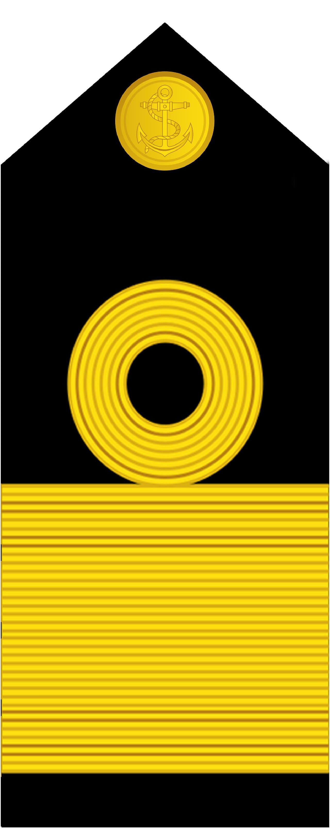
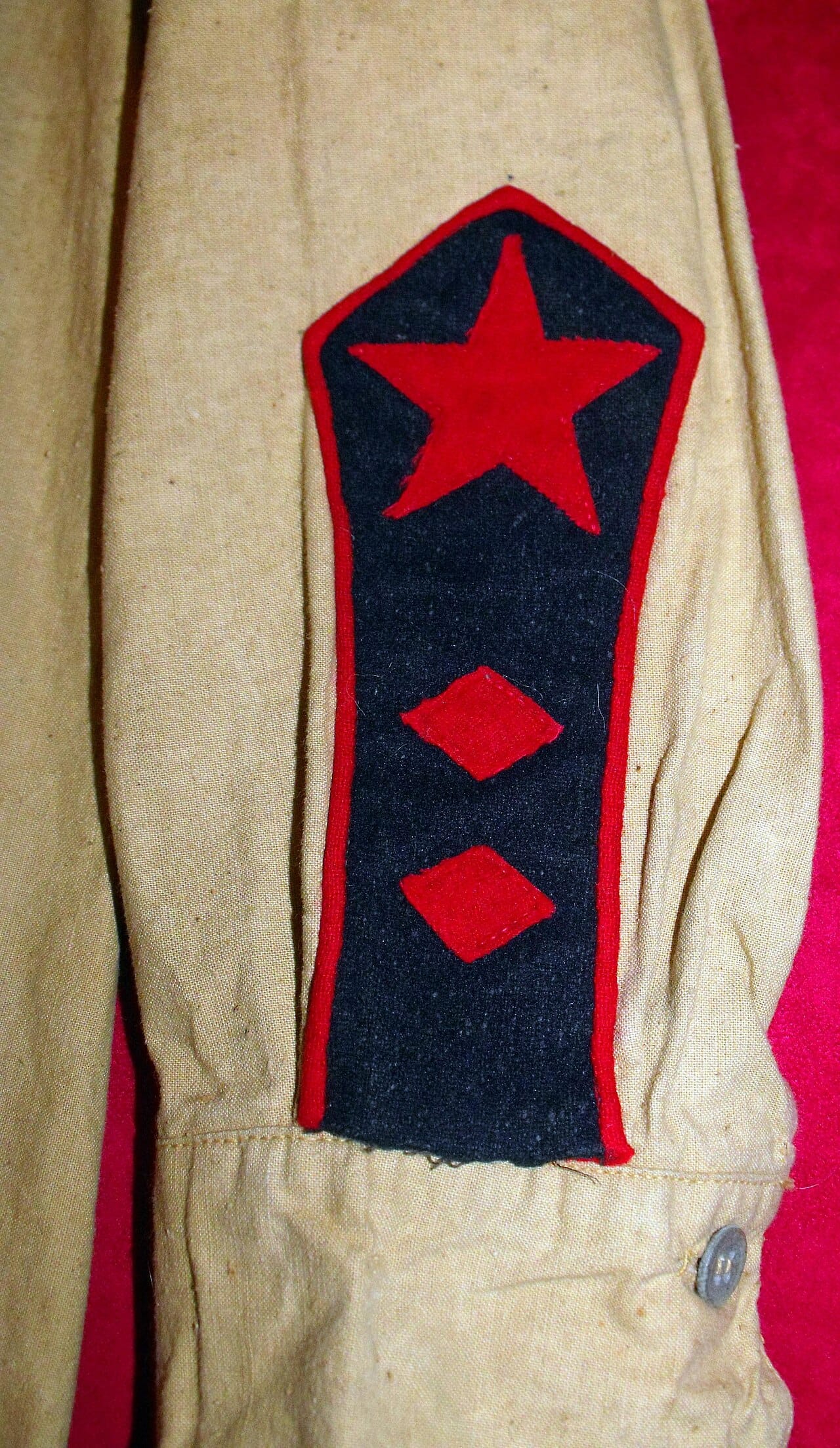
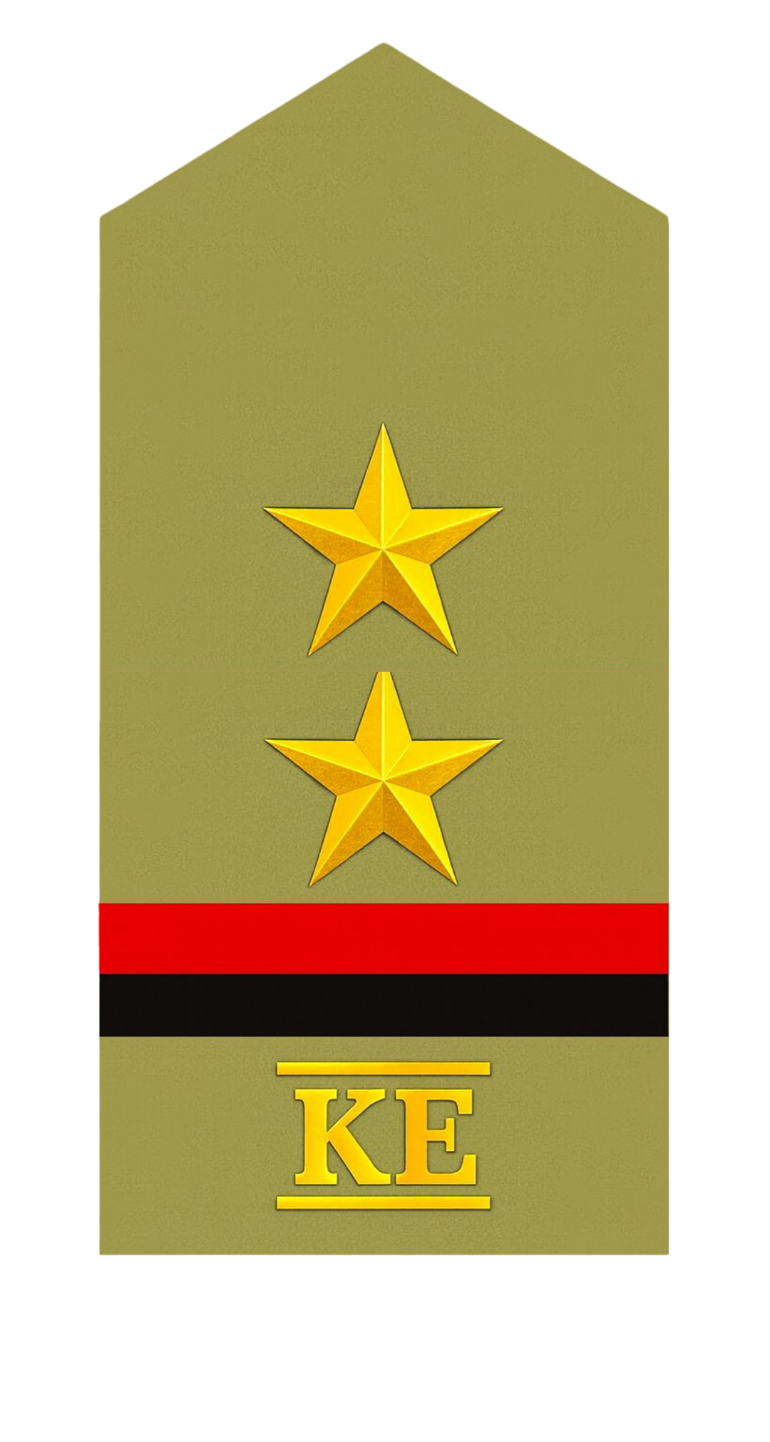
The third mode uses where a device sits and what it is made of. A board on the shoulder, a bar at the collar, a stripe at the cuff: the same object means different things in different places, and the material carries a second layer — gold above silver, metal above cloth, embroidery above print.
It is the most compact of the three and the least forgiving. A shoulder board has to be recognised as a shoulder board before anything on it can be read, which is why this mode belongs to services whose people see each other close up and daily, and why it is the mode that survives on a modern uniform when the sleeve has been given over to something else entirely.
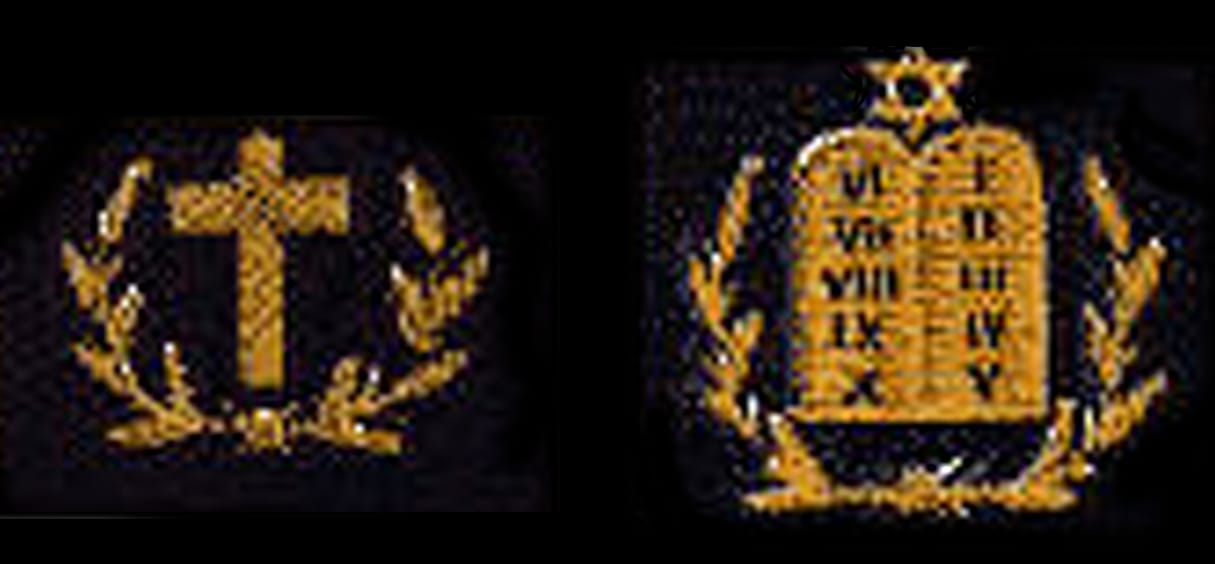
A commodore's shoulder board: a long stiffened strap, braid across its width, a device at the outer end. The shape is doing work before any of the marks are read. Nothing else on a uniform is this long, this narrow, or sits across the top of the shoulder.Wikimedia Commons · 151605820 · 2024-08-19 · Srinavy · CC BY-SA 4.0A Red Army branch insignia of 1923 for the medical service. Two facts on one device: which branch, and what rank within it. Combining them is efficient and is why insignia charts are so hard to read — most devices are answering more than one question.Wikimedia Commons · 153242791 · 2018-05-19 · Vincent Leone · CC BY 4.0Rank insignia for an Excise Inspector of the Kerala Excise Department. Civil services borrowed the whole apparatus. The grammar is military, the institution is not, and nothing about the object itself tells you which — the strongest evidence that these three modes are general rather than martial.Wikimedia Commons · 182286946 · 2026-01-23 · Asifalinair · CC BY 4.0A Merchant Marine chaplain's insignia. A branch device rather than a grade, and a reminder that most of what is pinned to a uniform is not rank at all. Charts that treat every metal object as a rung are why the subject looks impenetrable.Wikimedia Commons · 15319997 · Insignia are dated c.1943 · U.S. · Public domain
Sorted this way the material stops being a thicket. A sleeve of chevrons, a silk square and a shoulder board are not three unrelated traditions but three answers to one question — how does a stranger, at a glance, know where this person stands — and each answer trades legibility against range in a different proportion.
Which is also why the systems keep converging. Every service that starts with emblems eventually adds something countable, and every service that starts with counting eventually runs out of room and adds a device.
Hedda Maartens — MA in fashion design, then eleven years in the industry designing for people who had no say in what they wore. Now writes about prescribed dress: how a garment was made to work, and what it was made to make a person into.
Member discussion
Back
Nametape
Free
$0
Every Research post and every Essay, free to read.
All Research posts — one uniform at a time, in archive photographs












.png?ref=blog.neutrino.website)


Member discussion